Blending some sojourns, simplicity, and sustainability: Crafting Patagonia’s printed journey
Introduction
- Client
- Patagonia
- Year
- 2022
- Services
- Concept, graphic design, print production
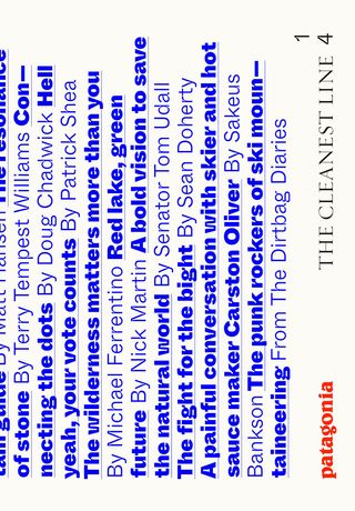
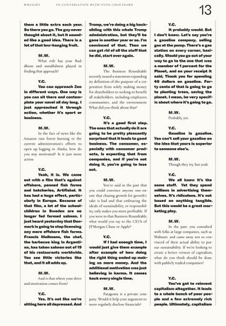
We had the thrilling opportunity to work with one of our favorite brands, Patagonia, to bring their “The Cleanest Line” blog into a printed format. The project centered around amplifying Patagonia’s “Live Simply” philosophy, blending understated typography with bold imagery to create a visually compelling journal (We prefer the word “zine”).
Problem
-
Digital divide
While Patagonia’s “The Cleanest Line” (now know as Patagonia Stories) blog has successfully communicated the brand’s environmental and social values online, it lacked a physical touchpoint that could extend these narratives into the hands of their audience. The challenge was to create a printed counterpart that would translate the blog's digital content into a tangible form. This required a design that could maintain the authenticity of the original stories while ensuring that the printed journal aligned with Patagonia’s strong commitment to environmental responsibility, providing readers a deeper, more personal connection to the brand.
Opportunity
-
Print meets purpose
This project provided an exciting opportunity to bring Patagonia’s storytelling into the physical world. We created a printed journal that not only serves as a magazine but also as a collectible piece that resonates with Patagonia’s environmental values. This approach deepens readers’ connection with the brand, allowing them to experience Patagonia’s stories in a tangible, lasting format that extends the digital content into an authentic print experience.
Strategy
-
Design with purpose
Our strategy was centered on translating Patagonia’s ethos into a print format while staying true to its environmental commitment. Every design choice was made to reflect the brand's philosophy and enhance the reader's connection with the content. -
Understated typography
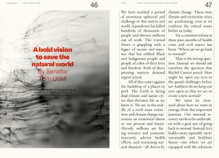
We chose simple, elegant typography to ensure that the focus remained on the content, allowing each story and image to resonate without visual clutter. The clean design enhanced readability, offering a calming experience that mirrors Patagonia’s approach to storytelling. This minimalist style allowed the journal to feel both modern and timeless. -
Bold imagery
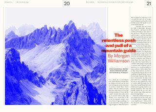
Patagonia’s breathtaking photography was given prominence throughout the journal. By immersing readers in stunning visuals of nature and adventure, the images transported them directly into the world that Patagonia seeks to protect, creating a strong emotional connection. -
Sustainable printing
To align with Patagonia’s environmental values, we selected recycled paper and inks made from algae and soy. This approach not only reduced the project’s ecological impact but also communicated Patagonia’s dedication to sustainable practices. Every material choice reinforced the brand’s narrative, ensuring that the final product was as environmentally mindful as the stories it contained.
Solution
-
Ephemeral meets tangible
The final journal is more than just a printed version of Patagonia lore—it’s a physical embodiment of the brand’s mission and values. By thoughtfully selecting recycled paper and eco-friendly inks, we ensured that the journal itself was a testament to Patagonia’s commitment to environmental stewardship. This approach transformed the journal into a purposeful, collectible piece that readers can hold, revisit, and connect with.The design emphasizes simplicity and authenticity, using understated typography and striking imagery to create an immersive experience that mirrors Patagonia's dedication to nature and social causes. By providing a tangible, lasting format, we bridged the gap between digital content and the physical world, creating a product that not only tells stories but also reinforces the brand's values every time it’s opened. This journal serves as a lasting reminder of Patagonia’s ethos, resonating with readers and solidifying their connection to the brand.


Quotable
Very, very, very, very cool!
Patagonia customer
Chicago, Illinois