Data Visualization
Designing data visualizations for maximum clarity, insight, and impact
Introduction
- Client
- McKinsey & Company
- Year
- 2017
- Services
- Data strategy, data visualization, information architecture
We worked with McKinsey & Company to enhance their data storytelling by creating engaging and intuitive data visualizations. Our objective was to turn complex data sets into clear, actionable insights that would resonate with both McKinsey’s clients and internal teams. By focusing on clarity and narrative flow, we aimed to make the data not just understandable, but also compelling for informed decision-making.
Problem
-
Lost in translation
McKinsey regularly analyzes large volumes of data to provide strategic insights for its clients. However, translating this data into an easily digestible and visually compelling format can be challenging, particularly when dealing with intricate, multifaceted information. Their existing visuals often lacked the narrative strength to guide clients through complex findings, making it difficult to highlight key insights. They needed a solution that could not only present information effectively but also craft a cohesive story, allowing clients to fully grasp the implications and make informed, strategic decisions with confidence.
Opportunity
-
Crafting complexity
Our task was to develop a suite of data visualization templates specifically tailored to McKinsey’s diverse analytical needs. These templates needed to be flexible enough to handle a variety of data types while maintaining a polished, professional aesthetic that aligns with McKinsey’s brand. We focused on creating visuals that balance sophistication with accessibility, allowing consultants to distill complex information into key insights that resonate with clients. By prioritizing clarity, narrative flow, and interactivity, we sought to provide McKinsey with the tools needed to communicate even the most intricate data sets with greater impact, precision, and engagement. This approach also ensured that the templates could be adapted across multiple projects, enhancing consistency and efficiency in their reporting process.
Strategy
-
Clarity through design
Our strategy revolved around building a visualization framework that balances aesthetics with functionality, ensuring the data is both compelling and easy to interpret. Our approach centered on three pillars. -
Data distilled
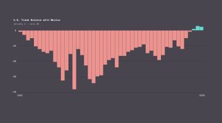
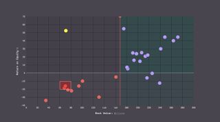
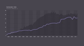
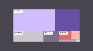
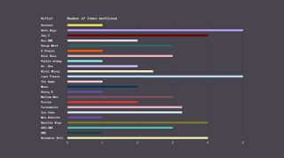
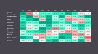
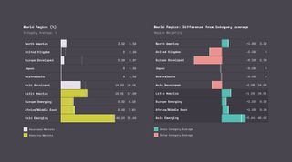
To avoid overwhelming viewers, we designed visualizations that distill large datasets into their most relevant components. This involved filtering out unnecessary details and honing in on key metrics that provide the most value. By breaking down complex information into digestible visuals, we made it easier for clients to identify trends, patterns, and actionable insights quickly. -
Visual consistency and delight
We developed a cohesive design language across all visual elements, including color schemes, typography, and iconography. This consistency not only reinforced McKinsey’s brand identity but also enhanced readability. With uniform visual cues, clients can navigate through various data visualizations with ease, enabling them to focus on the insights rather than the presentation format. -
Interactive insight
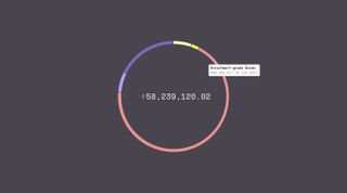
Recognizing that static visuals can often fall short in capturing the dynamic nature of data, we incorporated interactive features into our designs. These elements allow users to explore different data points, compare scenarios, and customize views based on specific needs. By offering this level of interactivity, we empowered users to engage with the data more deeply, fostering a better understanding of complex findings. Additionally, the interactive components made it possible for consultants to tailor their presentations in real-time, addressing client questions and diving into specific data areas as needed.
Solution
-
Data transformed, insights amplified
The result was a set of versatile data visualization templates tailored to McKinsey’s unique requirements. These templates transformed complex data into easily digestible visuals, fostering a deeper understanding and engagement among clients. The interactive features we implemented allowed users to explore data on their terms, making the insights not just informative but also actionable.The impact of this project was significant. McKinsey consultants reported increased client engagement during presentations, as the visualizations provided a clearer narrative for the data-driven strategies they recommended. Additionally, the standardized visual language improved the efficiency of their report generation process, ensuring a consistent and professional presentation of data across all client engagements.
Quotable
The new data visualization tools have truly transformed the way we present insights.
They bring clarity to complex data and allow our clients to quickly grasp the narrative behind the numbers.
Senior Partner
McKinsey & Company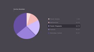

Quotable
Graphical excellence is that which gives to the viewer the greatest number of ideas in the shortest time with the least ink in the smallest space.
Edward Tufte
The Visual Display of Quantitative Information